This work gained me membership in the International Society of Typographic Designers.
ISTD, is a professional body run by and for typographers, graphic designers and educators. The Society has an international membership who share and support its aim to create and inspire interest in all forms of typographic communication.
Membership is awarded to practising designers, educators and graduating students who demonstrate, through the quality of their work, their commitment to achieving the highest possible standard of visual communication.
Becoming accepted as a member of the ISTD gives you a professional qualification which is held in great respect by the design industry.
Strategy:
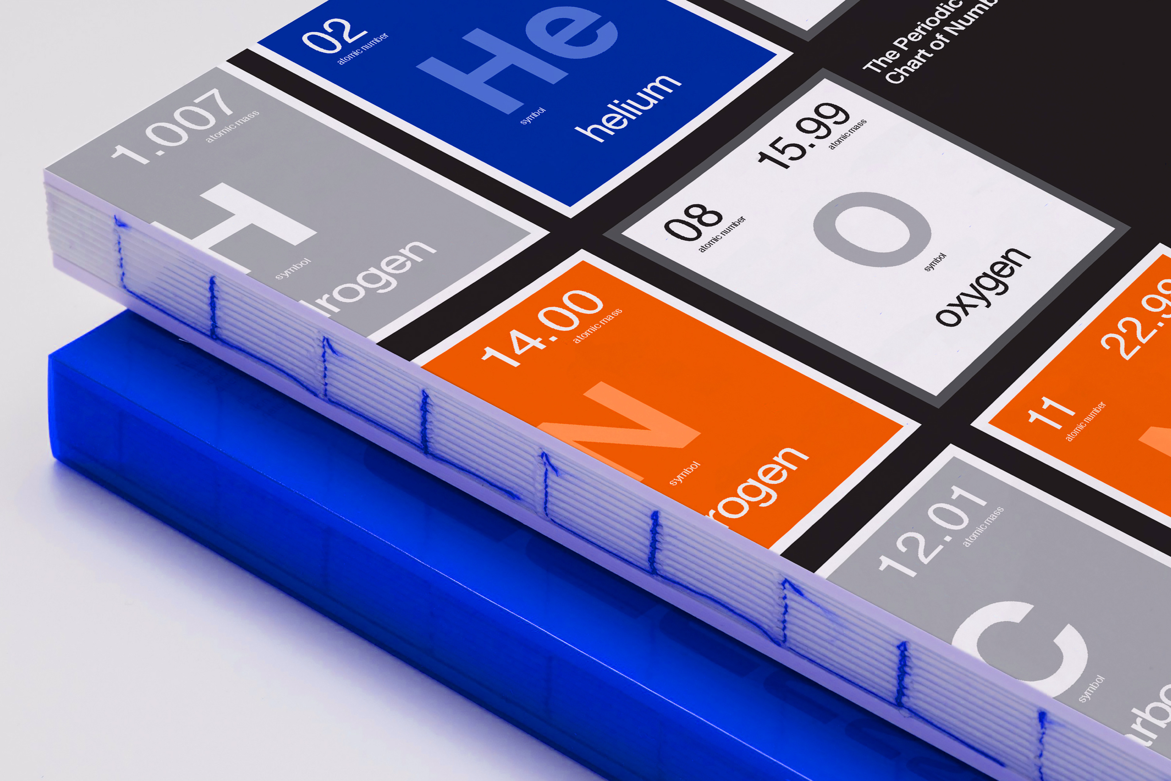
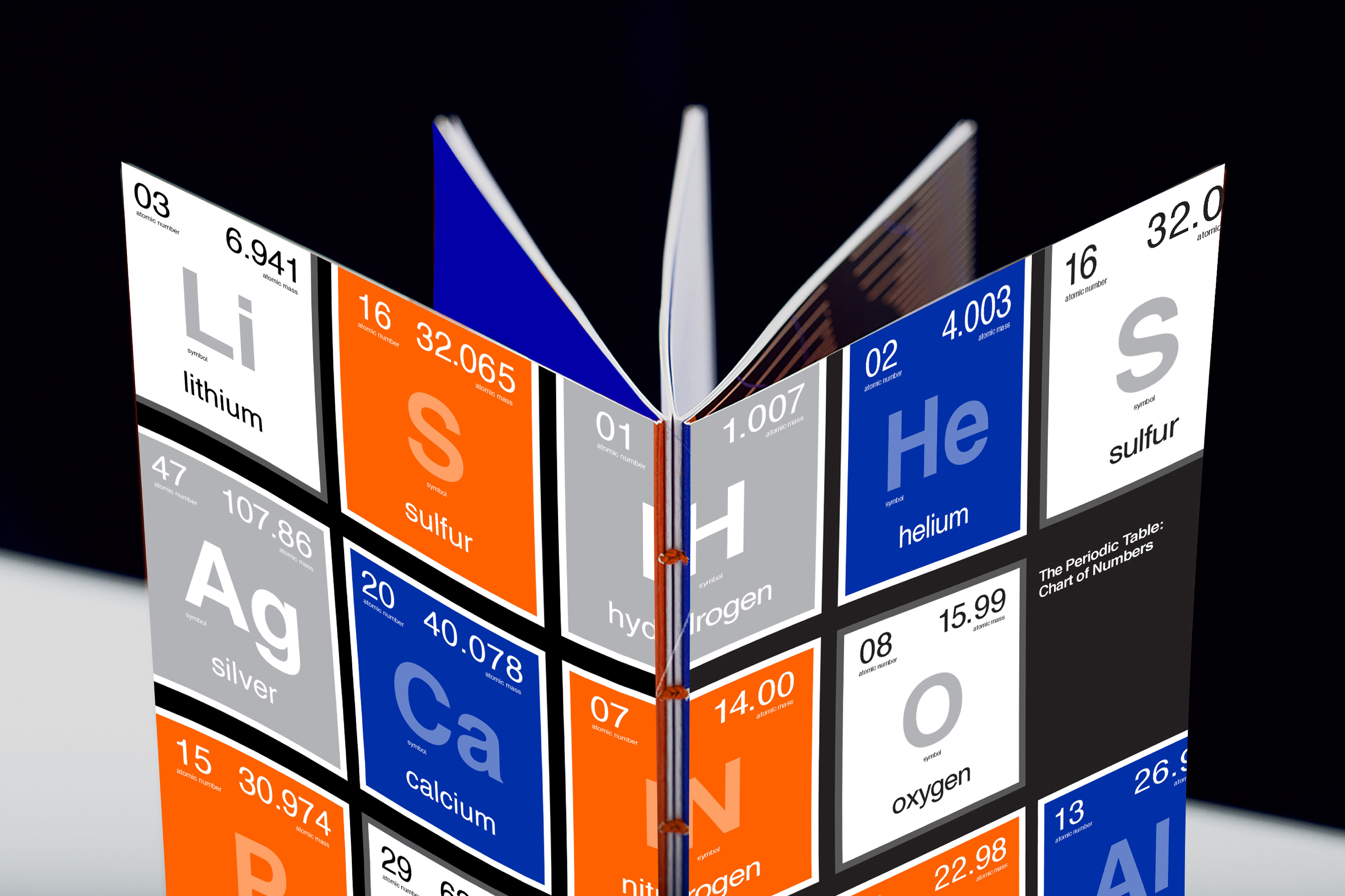
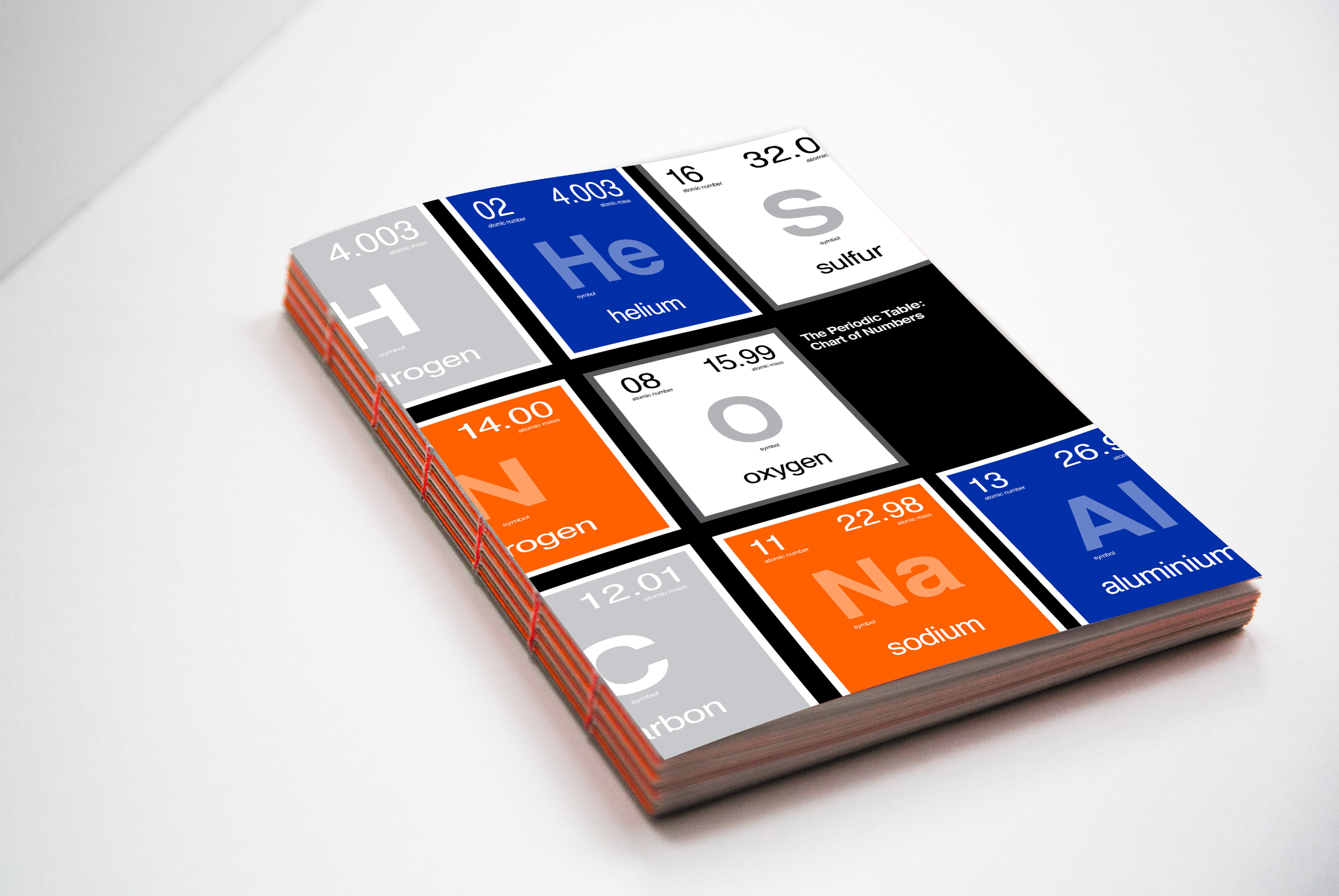
‘The Periodic Table: Chart of Numbers’ is an artefact designed in response to the ISTD student assessment brief 'The Significance of Numbers'. This project aims to be a celebration of the significance of numbers in our lives and establishes a clear understanding of how numbers give meaning to the world around us. To answer this brief I have explored the Periodic Table of Elements, an array of numbers structured to provide a succinct organisation of the whole of chemistry. Numbers help us to comprehend the complexity of the table and each number means something significant to the world around us. The numbers influence our everyday. We eat and breathe the periodic table; we stand and live in it.
My conceptual direction takes the reader on a journey of scientific discovery through the curation of the austere chart of numbers. It explores how the table came to be, how it is today and why the founder became so famous. It then delves into the chemical elements themselves and talks about 5 of the elements most significant and vital for our existence.
This artefact is aimed to peak interest in science, I find that scientific material is not well designed and saw this as an opportunity to create a well-designed book to entice everyday people to learn more about the chemical makeup of our world and how numbers have a huge role in them.
I have used two fonts that are well known in the general public, typefaces that are robust and have been used without fail. I have used Helvetica as my sans-serif typeface because of its long history and reputation of typographic excellence and outstanding design just like the Periodic Table. This has been complemented with Bembo to give my artefact a historic, discovery feel and because of it being known as an attractive, legible book typeface.
I have used Orange and Blue as they are complementary colours and give a clean, scientific but modern look. Blue is considered beneficial to the mind and body. It produces a calming effect - I do not want readers feeling overwhelmed by the amount of scientific information. Blue also symbolises trust, depth, intelligence and stability. Orange can be interpreted as a colour that is informal. My topic is quite factual and structured, I didn't want it to be too serious otherwise my audience wouldn't pick it up. Orange can represent change and movement in general, the Periodic Table was a structure that changed frequently when it was first being organised due to new research and findings. Orange is unimposing and doesn't offend, it just exists.
Coptic binding reinforces my concept of a handmade collection and gathering of knowledge from scientists over many years. The Periodic Table is a curation of years worth of discovery and testing. Coptic binding shows the stitching of each page, it’s not perfect bound and it’s not clean but shows the structure of the book and how each element has been placed together.