In collaboration with Alicia Bidlake and Hannah Mainwaring.
We interpreted CubaDupa as a chaotic, creative fusion of Wellington’s energetic and expressive people. This led us to centre our brand essence on CubaDupa as a celebration of the chaotic fusion of cultures, arts and foods.
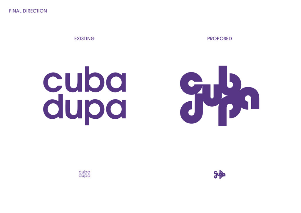
Our proposed wordmark uses round, welcoming letterforms placed in a chaotic non-linear arrangement. Each letter is fused to another to represent the different parts of the festival.
We opted for a bold typographic wordmark to not only express our brand essence but for practicality. It can be used in any colour, reversed out, scaled up or down and with the addition of images.
The animation shows the chaos fusing together to form our wordmark.
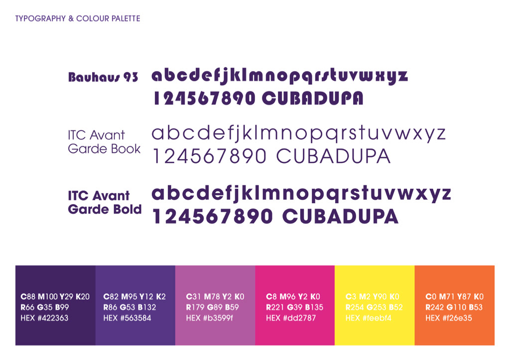
We’ve continued to use CubaDupa’s current geometric sans typeface and their bright, warm colour palette.
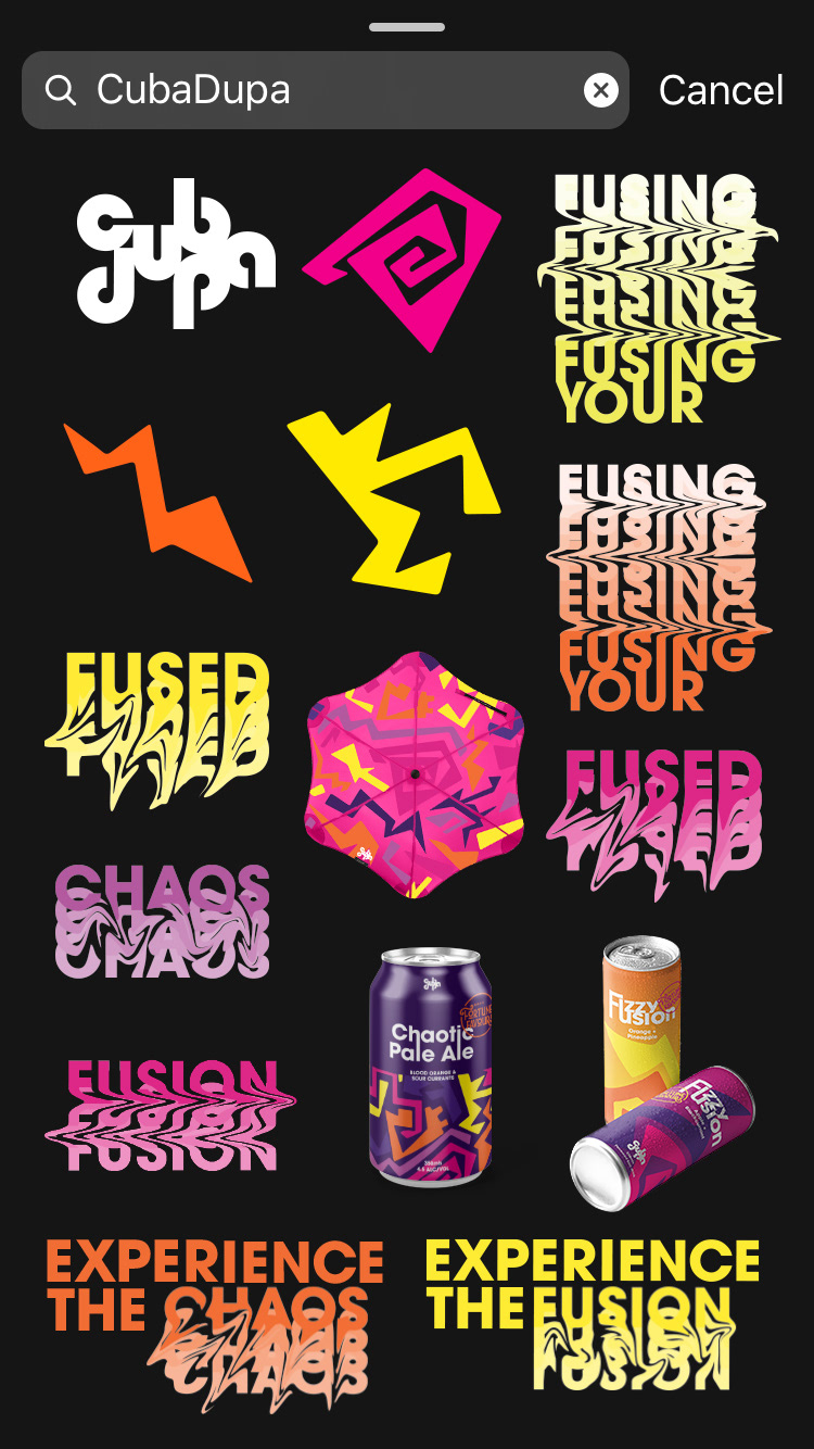
We’ve used bold, chaotic shapes that fit and fuse together. They can be scaled or deconstructed to form an endless amount of new patterns. We have used a series of wordplays to enhance our brand essence throughout our dynamic narrative. When applying the wordplays to our narrative we graphically fused the text together.
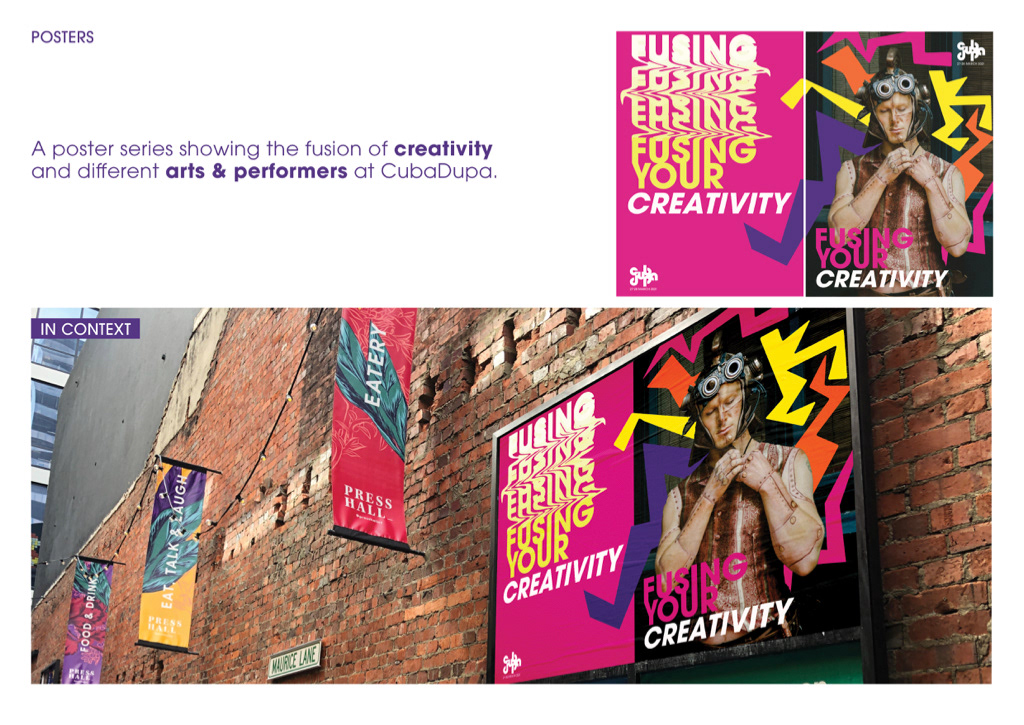
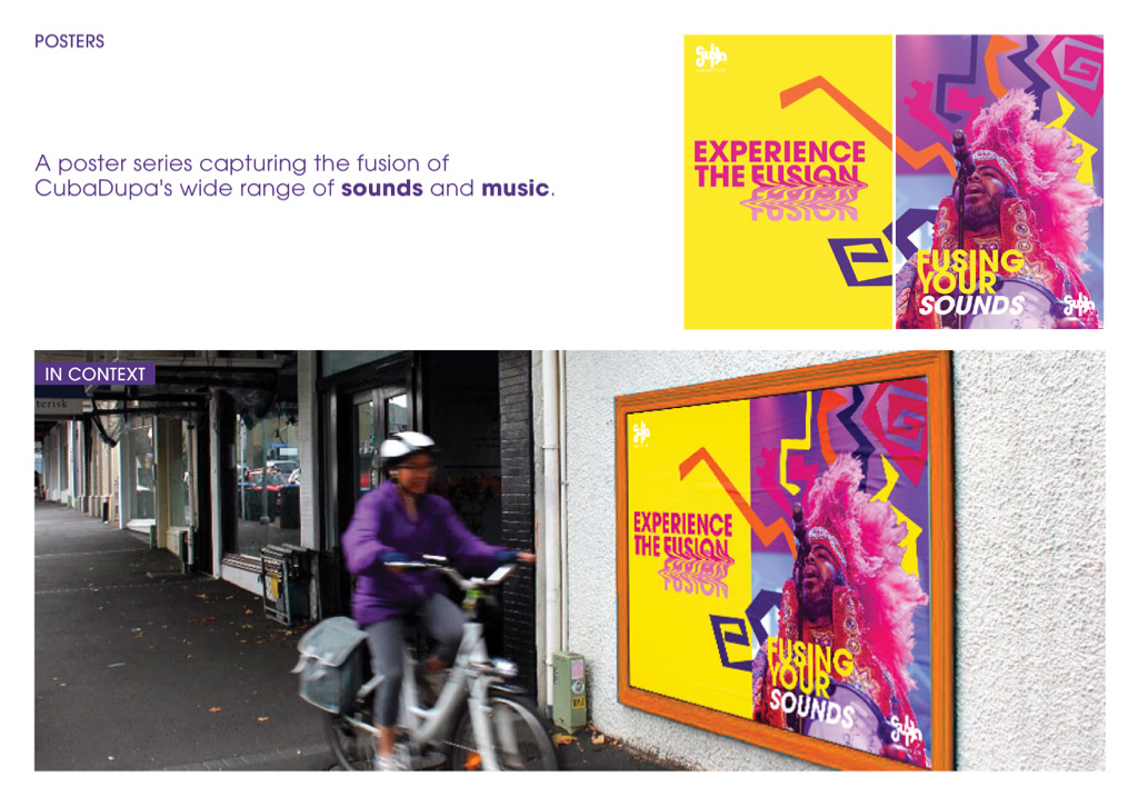
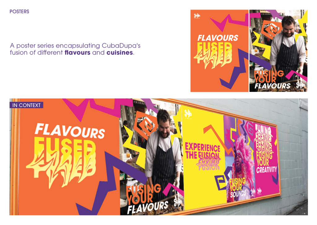
Within our posters we decided it was important to include a human aspect by showcasing the contributors so that the audience can get excited prior to the festival. We’ve explored a combination of typographic warping and photographic approaches.
The first series highlights the fusion of different performers and artists' creativity.
Whereas, this series captures the diversity of music and sounds at CubaDupa.
In the third series we showcase the flavours and food from different cultures, all fused together at the festival.
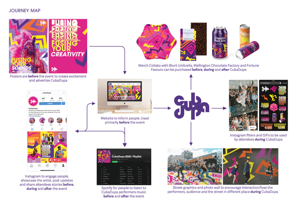
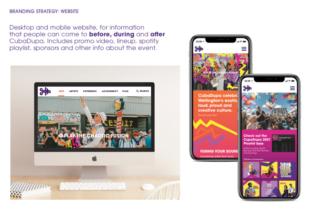
Our website is an informative way to seek details about CubaDupa before, during and after the festival. It features a promo video, the artist lineup and the Spotify playlist.
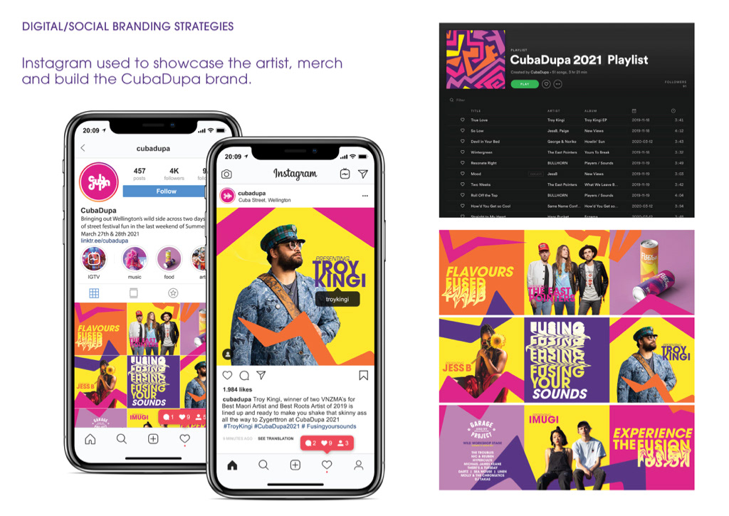
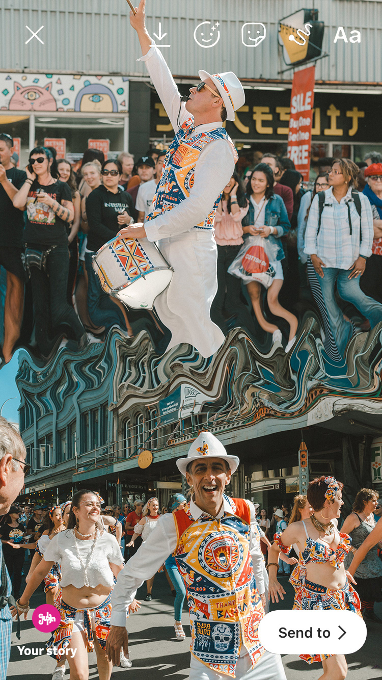
One of our social branding strategies is Instagram. We used this because of its wide range of audiences and evolving features. The enlarged patterns immerse participants deeper into the CubaDupa experience before, during and after the event. All posts are connected with the shapes 'fusing' the artists, attendees, merch and the festival together. The Spotify playlist is used to fuse peoples music preferences and the range of artists at CubaDupa.
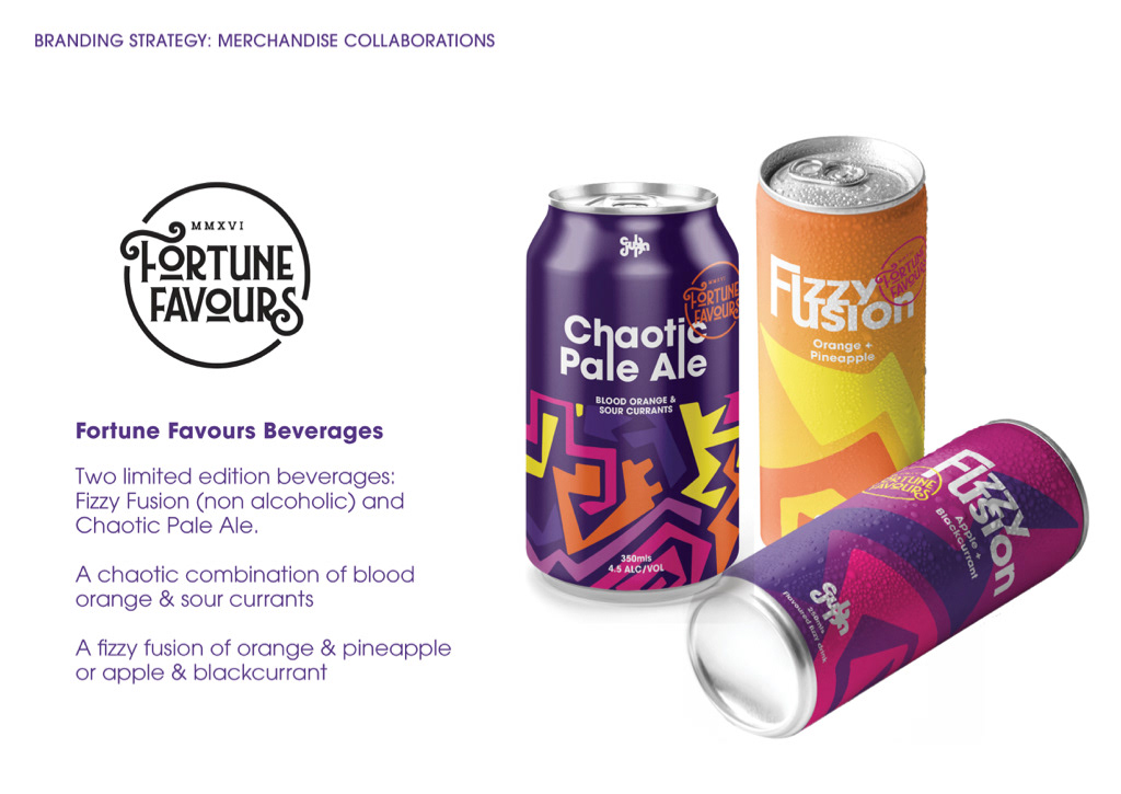
We’ve decided as part of our brand strategy that we wanted to collaborate with 3 brands which we felt encompassed Wellington’s culture. CubaDupa is a fusion of creativity so fusing with these brands is an important part of our narrative. Our first brand collaboration with Fortune Favours features two limited edition drinks targeted at different audiences. A Chaotic Pale Ale, and a non-alcoholic Fizzy Fusion, both fusions of different flavours.
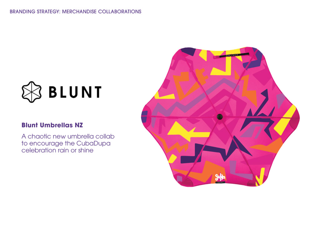
We collaborated with Blunt Umbrellas to encourage the festival to go ahead and people to attend, despite the weather. The umbrella goes beyond the festival weekend, it’s something people would keep, fusing their CubaDupa experience with their everyday life.
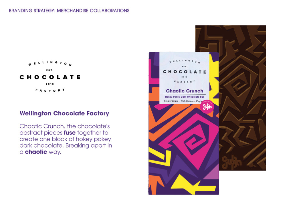
Our collaboration with Wellington Chocolate Factory created Chaotic Crunch. A chocolate bar with abstract pieces fused together to create one block of hokey pokey dark chocolate, which would be broken apart in a chaotic way.
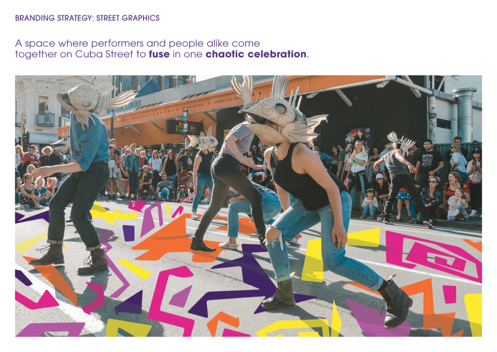
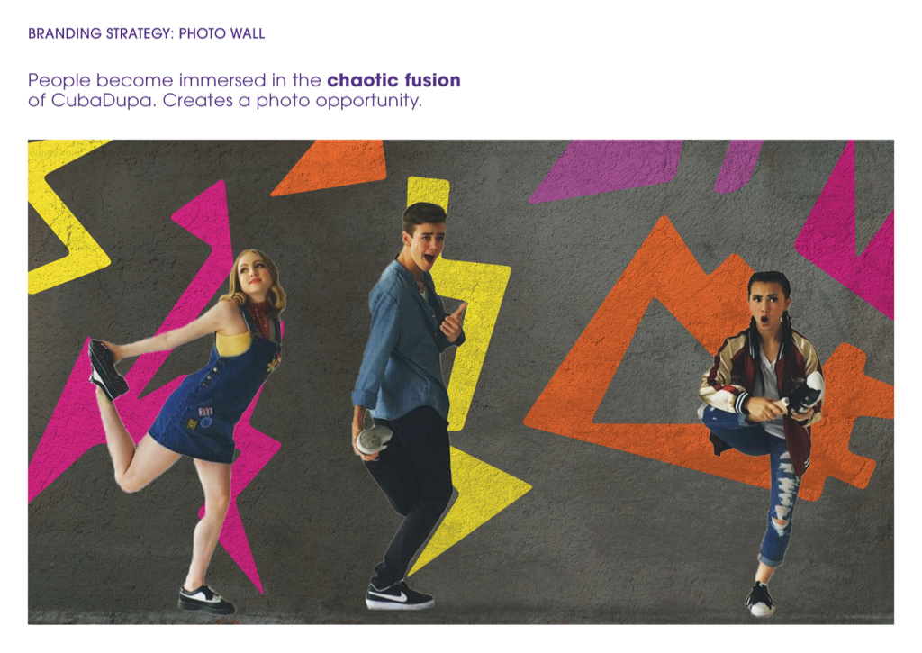
Our street graphics provide a dance-floor space where performers and participants come together on Cuba Street to fuse in one chaotic celebration. Our photo wall is an opportunity for participants to pose in chaotic ways mimicking the shapes.
Another social branding strategy is the use of an Instagram filter and GIFs. Our filter allows attendees of the festival to take two separate pictures which are then fused together.
Our journey map is an overview of our different branding strategies and a timeline of when each would be used.